PRIMARY
Brand
guidelines.
GV CAPITALMAKES SPACE.
01 / THE BRAND · GV CAPITAL
Space for projects, partners and growth.
GV Capital is an investment and development holding. We start with industrial and logistics space in Georgia.
TrustPartnershipLong-term view

Values, promise, audiences and the name
What we stand for
- Trust
- We do what we said we'd do.
- Partnership
- The building changes hands. The relationship doesn't.
- Long-term view
- We build for twenty years from now.
Who we talk to
- Investors
- Want scale, and risk they can put a number on.
- Partners
- Developers, operators, finance and construction.
- Business
- Companies that need production or warehouse space of their own.
Purpose
We put investment and development under one roof, so business has room to grow.
Vision
Spaces that still earn their keep in twenty years. Partnerships that outlast the project that started them.
Promise
We build space that still works in twenty years. The relationship doesn't end when the building is sold.
Everything we make should live up to this. It isn't the slogan, and it rarely appears as copy.
What makes us different
- One structure
- Investment and development sit in the same holding. One project, one logic, from financing to handover.
- Sold, not leased
- You own the building. You're not signing a lease.
- Buy at your size
- Take the whole complex, or a single unit.
All three are facts, not claims. We don’t say “best” or “market leader”.
GV Capital · Georgian Ventures. Two letters and one word - short, and it travels. It reads the same in Georgian and English, and it isn’t tied to one sector or one place.
Name the levels in order: holding → market → project. Industrial & Logistics is where we started, not the limit of what the holding covers.
01.1 / NAME & ARCHITECTURE
Georgian Ventures.
One holding. Room to grow. Always written as GV Capital.
SimpleInternationalBuilt to grow
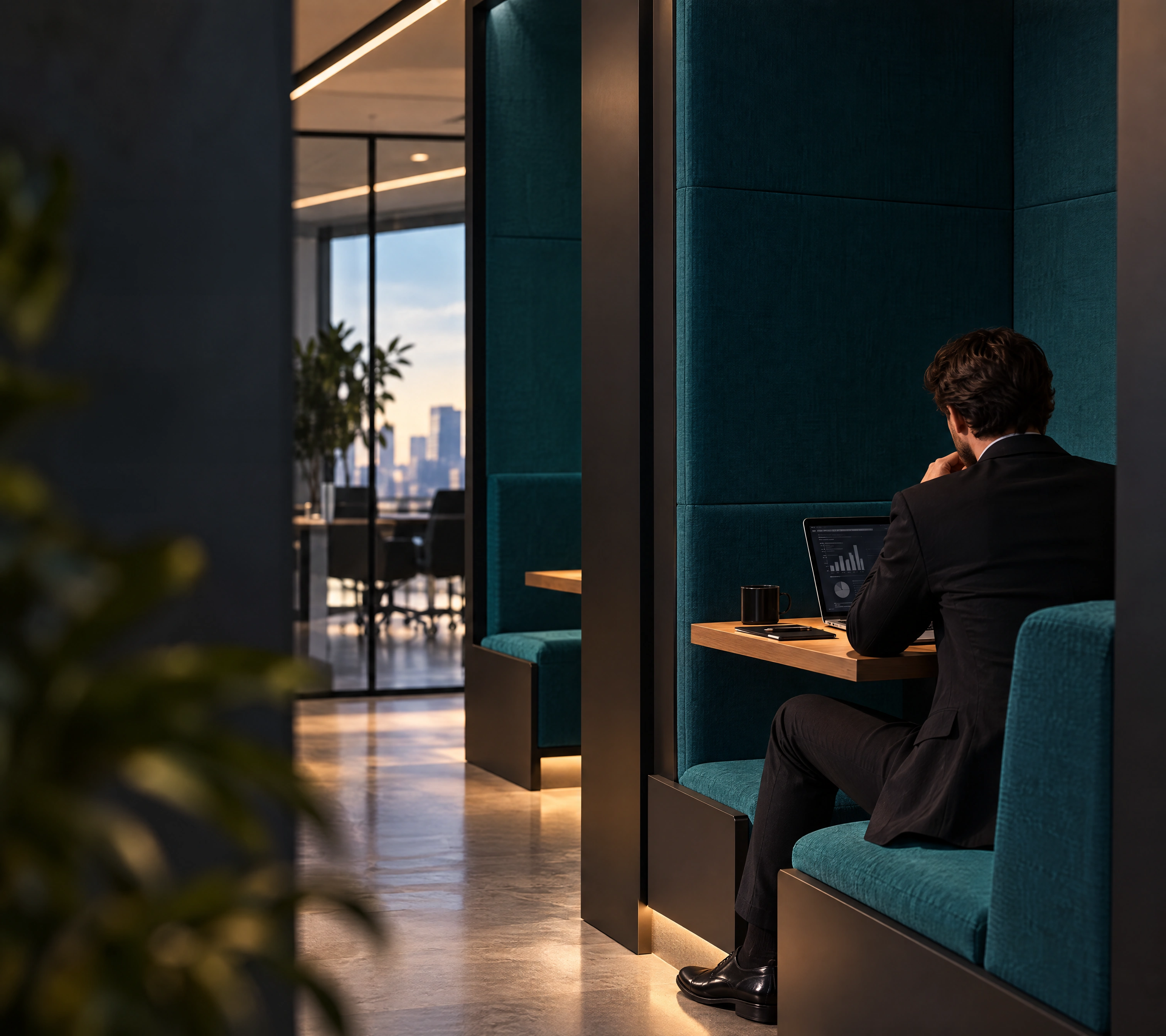
Our name, structure and locations
Writing our name
- GV Capital
- Always use Latin letters, in every language. In running text, avoid:
GV CAPITAL,Gv Capital,GVCapital. The logo and approved graphic compositions keep their original form.
Brand structure
- Holding
- GV Capital
- Business area
- Industrial & Logistics
- Project
- Locations: Lilo · Ponichala · Teleti.
Why GV Capital Two words. A clear identity with room for new ventures.
Our voice
01.2 / VERBAL IDENTITY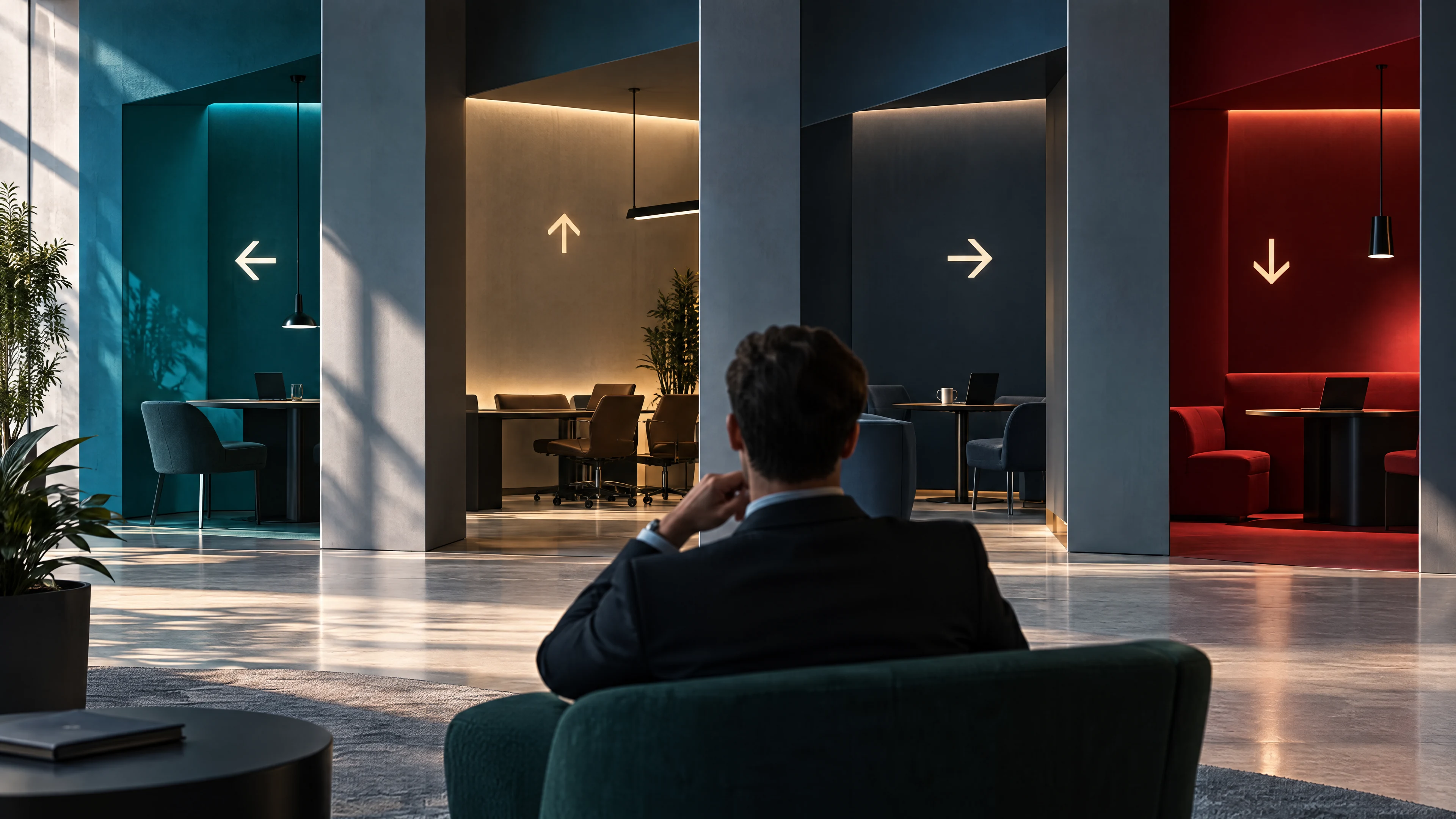
Brand statementGV Capital makes space.The core idea behind the brand: appears on the cover, in the marquee, and in the Space Field graphic. Not repeated as a slogan.
TaglineSpace that creates opportunities.The permanent slogan: used consistently wherever a tagline is needed.
Brand voiceDirect. Calm. Ready to act.
Combined lockupGV Capital. Space that creates opportunities.The approved pairing of both phrases: reserved for signature and closing layouts.
How we write
01.3 / WRITING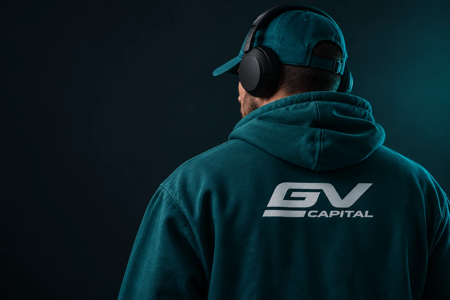
Keep it short.
One sentence. One idea.
Be specific.
Let the facts do the talking.
Make it useful.
Give people a clear next step.
The idea behind the brandGV CAPITALSPACEPOSSIBILITY
What we leave outClaims of leadership·Unverified numbers·Promises without proof
Numbers and units31,406.00 m²
02 / LOGO
Logo
One mark. Fixed geometry. Clear recognition.
Emerald on light. White or metal on dark.
02.1 / LOGO
Clear Space
Leave at least X around the logo.
XCAPITAL
X = The height of one capital letter in CAPITAL
Minimum Size & Fixed Form
Minimum width
- 30 mm
- DIGITAL
- 160 px
A starting point. Check a printed sample before production.

Fixed form
Keep the shape
Do not rotate, stretch or compress the logo.
Keep the colour
Use approved colours. No gradients, shadows or split colours.
Use the original
Never retype CAPITAL. Use the full logo wherever it fits.
Keep it clear
Give the logo enough contrast. Emerald on light. White on dark.
No effects
No shadows, 3D effects, outlines or reflections.
Let it stand alone
Do not place the logo inside a badge, button or frame.
03 / COLOUR
Colour System
GV Emerald is the primary colour. Signal Orange is reserved for small accents.
LIGHT
DARK
ACCENT / ≤5%
50%30%15%≤5%
A guide to colour balance. Select a code to copy it.
PRODUCTION REFERENCE
CMYK91 / 9 / 0 / 56
PANTONE7715 C · 7715 U
RAL5021 · Water Blue
Accents, contrast and production +
Signal Orange #FF5804 adds a small point of focus: a line, sign, action or number. A white logo on orange is reserved for signal-led messages, not the main identity.
Use white or metal signage on dark #111615 façades. Emerald can fill a full brand surface. The 50/30/15/5 balance is a guide, not a fixed rule for every layout.
Digital master: #0A6670. Print references: CMYK 91/9/0/56 or Pantone 7715 C/U. Architectural reference: RAL 5021. Check the colour on the final material before production.
04 / TYPOGRAPHY
Typography
AKTIV GROTESK EXTENDED / HEADINGS · AKTIV GROTESK / BODY
BRAND TYPE / 01
Aktiv
Aktiv
Grotesk
STYLE
- Regular
- Italic
- Bold
TYPE
Aa Bb Cc Dd Ee Ff Gg
Hh Ii Jj Kk Ll Mm Nn
Oo Pp Qq Rr Ss Tt Uu
Vv Ww Xx Yy Zz
0123456789 & @
REGULAR
ITALIC
BOLD
PAIRINGS
See them work together. Pre-styled combinations for common use cases. Match these sizes and weights exactly to stay consistent across every touchpoint.
GV CAPITAL
Space that creates
Space that creates
opportunities.
INVESTMENT & VISION
Long-term value
Long-term value
built with intention.
LOGISTICS & INDUSTRY
Strategic infrastructure,
Strategic infrastructure,
scaled.
Next-generation logistics hubs, modern warehousing, and industrial parks in Georgia.
ROLE
TYPEFACE & WEIGHT
SIZE / LINE-HEIGHT / TRACKING
APPLICATION & USAGE
H1 Display
Aktiv Grotesk Extended · Medium (500)
64–128px / 0.99 · -0.065em
Hero statements, presentation titles, billboard covers
H2 Section
Aktiv Grotesk Extended · Black (900)
24–30px / 1.25 · -0.03em
Section headings, slide titles, major chapter openers
H3 Subhead
Aktiv Grotesk Extended · Bold (700)
15–18px / 1.35 · -0.02em
Subheadings, key thesis callouts, deck lead-ins
Body Copy
Aktiv Grotesk · Regular (400)
12.5–14px / 1.60 · 0.00em
Primary editorial text, paragraphs, reports, documentation
Meta Label
Aktiv Grotesk · Medium (500)
10–11px / 1.40 · +0.08em (Caps)
Kickers, eyebrow labels, data captions, UI status indicators
Black (900) is available only in Aktiv Grotesk Extendedfor Latin headlines. Georgian Aktiv Grotesk Georgian runs from 400 to 700. Use Bold for Georgian headlines. Never simulate a heavier weight.
The local Aktiv Grotesk font could not load. Refresh the page and try again.
APPROVED TYPE SYSTEM / ONE FAMILY
HEADINGSAKTIV GROTESK EXTENDED
BODYAKTIV GROTESK
04.2 / TYPE HIERARCHY
GV CAPITAL
12 PX
Eyebrow
100% LEADING
72 PX
Heading &
100% LEADING
42 PX
Subheading
110% LEADING
20 PX
Space for projects,
partnerships and
long-term growth.
A1
DISPLAY2.5×100% LEADING
A consistent hierarchy keeps every message clear, confident and recognisably GV Capital across formats.
CAPTIONS120% LEADING
05 / GRAPHIC LANGUAGE
Graphic Language
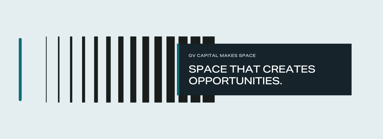
GV Space Field. EDGE / SIGNATURE / WINDOW. Always with the tagline.
How to use it
Three fixed versions
EDGE. SIGNATURE. WINDOW. Use the supplied layouts as they are.
Always with the tagline
The graphic and SPACE THAT CREATES OPPORTUNITIES. are one asset. Keep them together.
Scale in proportion
Do not crop, recolour or rearrange it. If the tagline becomes too small to read, use the logo alone.
ONE LIBRARY / 12 SYMBOLS
DOWNLOAD SYMBOL + SIGN SET
A CLEAR VISUAL LANGUAGE
Familiar symbols. Clear destinations. Nothing added to the shape.

RECEPTION
DOWNLOAD ↓
MEETING ROOM
DOWNLOAD ↓
BOARDROOM
DOWNLOAD ↓
FOCUS ROOM
DOWNLOAD ↓
RESTROOMS
DOWNLOAD ↓
ELEVATOR
DOWNLOAD ↓
STAIRS
DOWNLOAD ↓
EXIT
DOWNLOAD ↓
PARKING
DOWNLOAD ↓
FIRST AID
DOWNLOAD ↓
NO SMOKING
DOWNLOAD ↓
CAFE
DOWNLOAD ↓
KEEP THE SHAPE
Use the filled library symbol as supplied. No outlines, stripes or decorative cuts.
LET THE MESSAGE LEAD
Pair the icon with a clear label. Keep the destination and direction clear.
BRAND WITH RESTRAINT
Use brand colour and typography. Room numbers and restroom signs do not need a logo.
06 / DIGITAL
Digital
Form, colour and motion on screen.
WEBSITE DIRECTIONOne brand.
One brand.
Clear at every scale.
A homepage, project page and news template. Designed for every screen.
VIEW WEBSITE ↗WORKING FILES ↓07 / IN CONTEXT
Physical Environment
A consistent identity across space and movement.
Office
Logo walls, glass partitions and wayfinding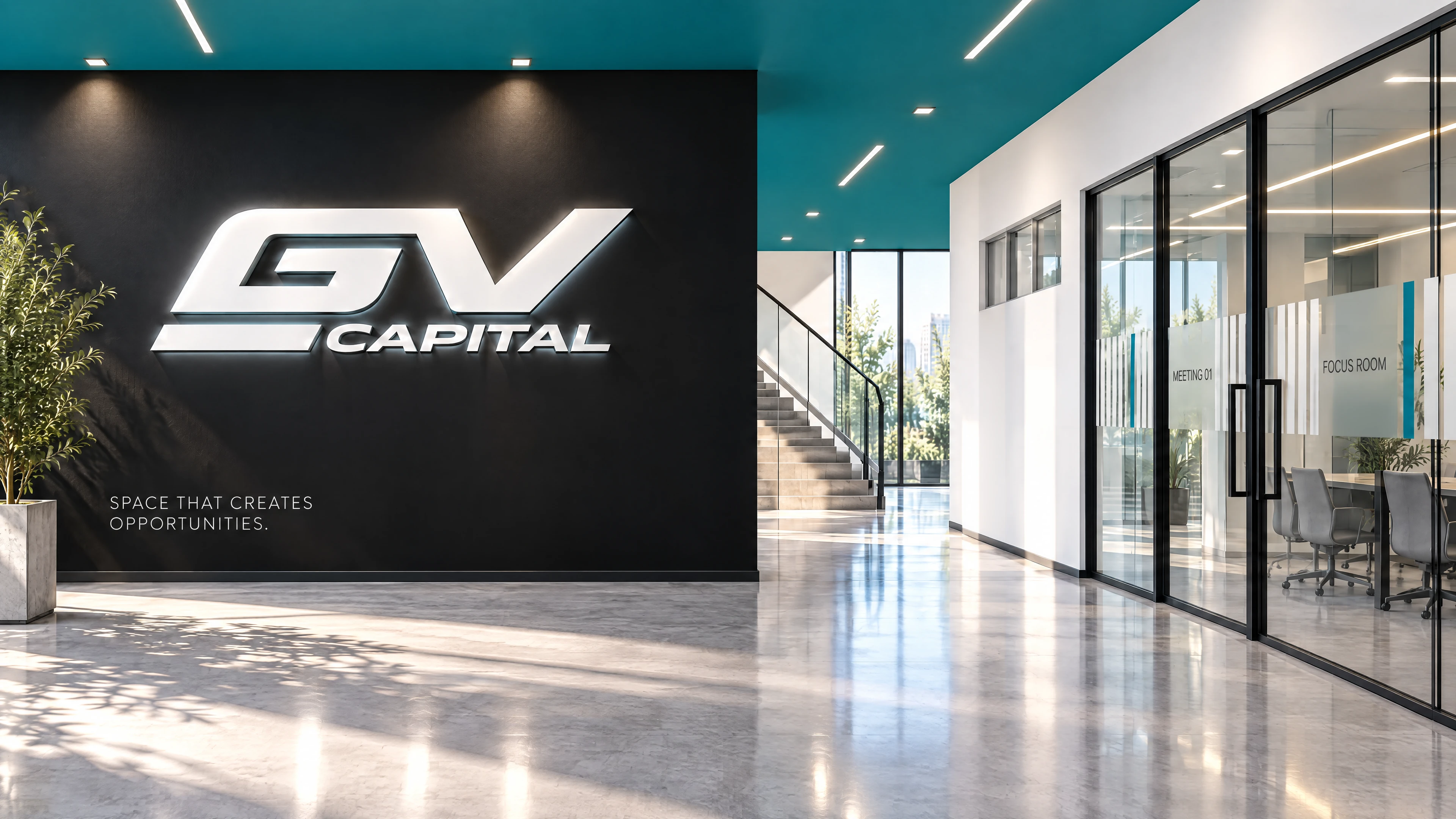
07 / WAYFINDING
WAYFINDING IN SPACE
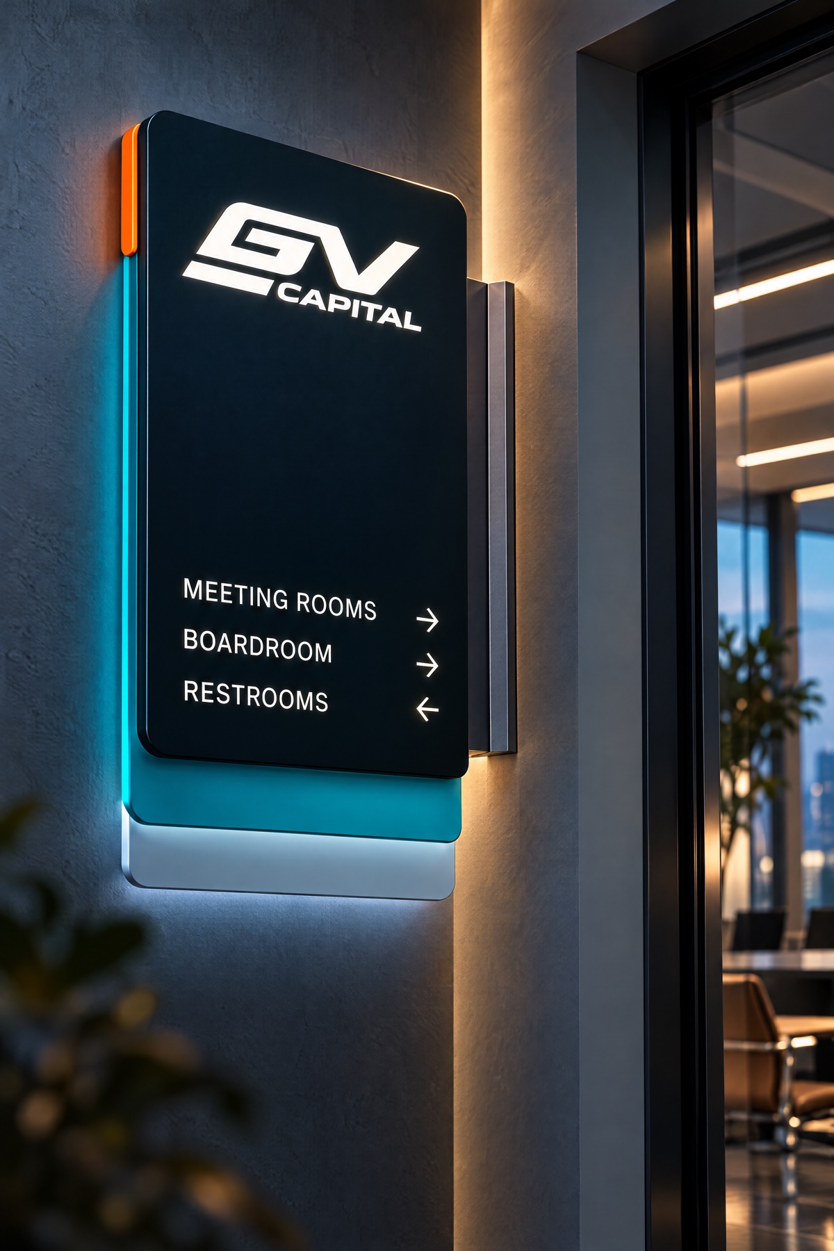
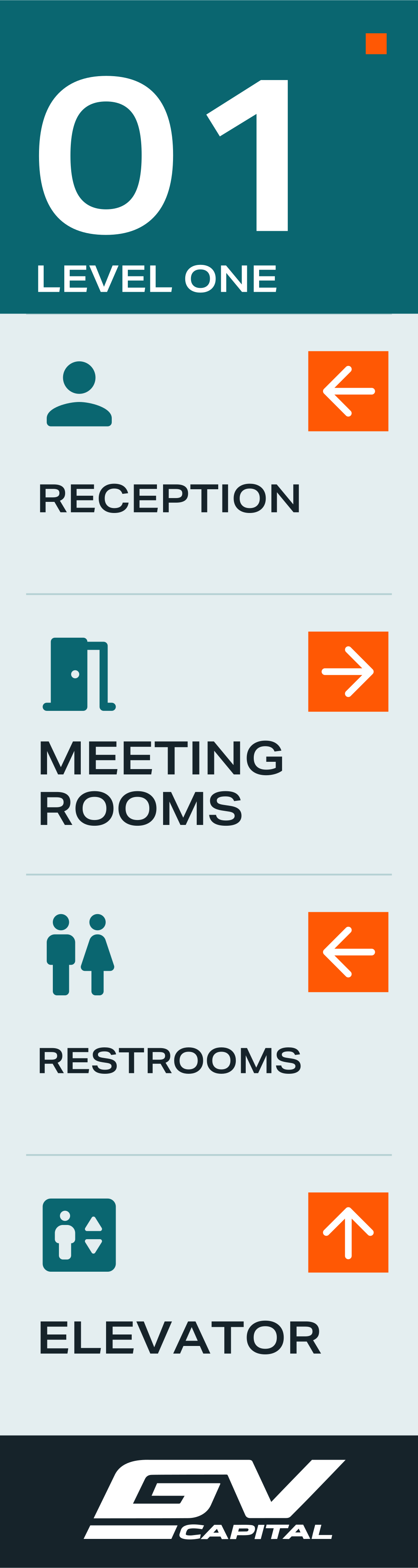
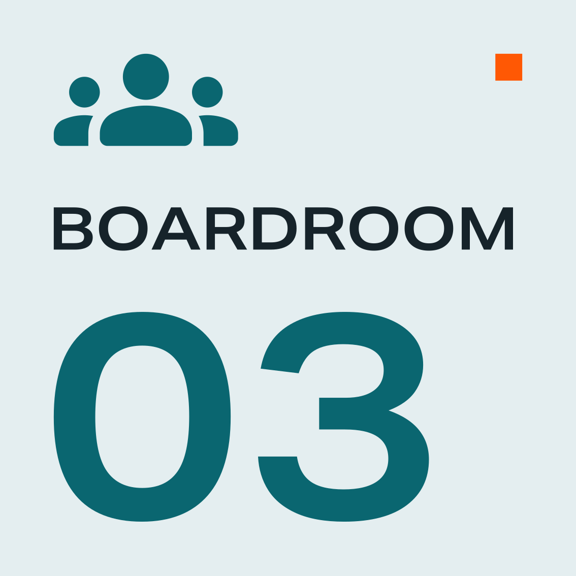
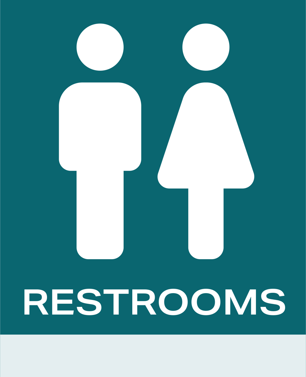
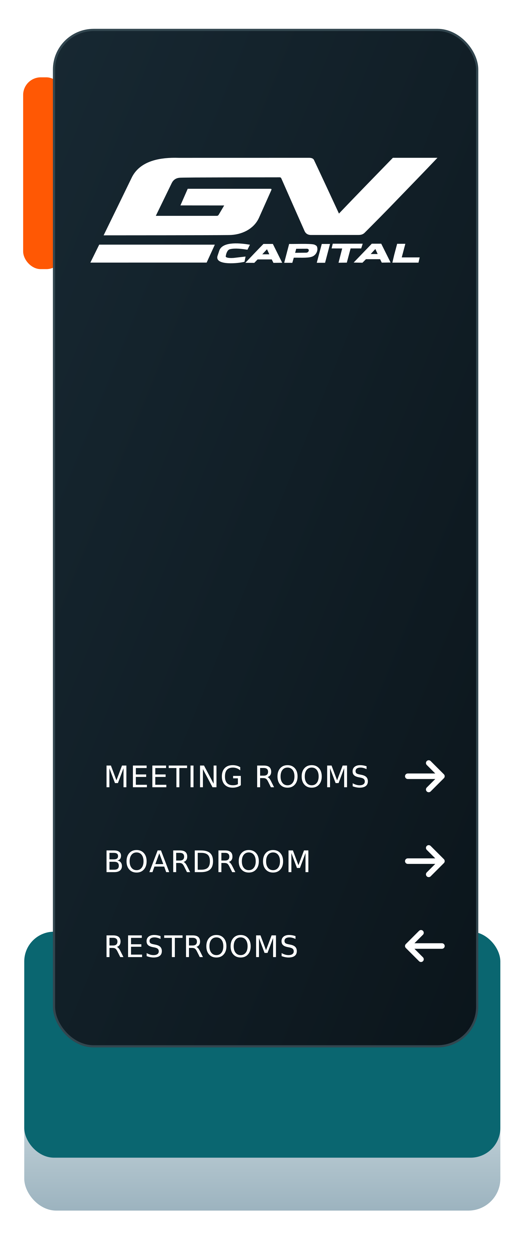
SIGN FACE SYSTEM
FIVE FORMATS. ONE CONSTRUCTION LOGIC
 VIEW FULL SIZE
01 / FLOOR DIRECTORY480 × 1800 MM / DOWNLOAD SIGN
 VIEW FULL SIZE
02 / OVERHEAD SIGN1500 × 280 MM / DOWNLOAD SIGN
 VIEW FULL SIZE
03 / ROOM IDENTIFICATION300 × 300 MM / DOWNLOAD SIGN
 VIEW FULL SIZE
04 / RESTROOMS BLADE260 × 320 MM / DOWNLOAD SIGN
 VIEW FULL SIZE
05 / PARKING SIGN240 × 1400 MM / DOWNLOAD SIGN
12 WAYFINDING SYMBOLSMATCHING PRINT SYMBOLS / ORIGINAL VECTORS
Exterior
Façade signage and flagsFleet
The brand on the move08 / CORPORATE
Corporate Materials
A consistent format for everyday business communication.
08.1 / CORPORATE COMMUNICATION
Email signature.
Your name. Our signature.
Preview · Add your detailsPRIMARY / 2× PNG
PNG keeps the brand font. HTML keeps your contact links active.
How do I add it to my email?
- Add your details. COPY SIGNATURE copies your signature with working links. Start here.
- Paste into your email signature settings. If images are missing, download the PNG and insert it at 600 px (PRIMARY) or 480 px (COMPACT). Files are saved at 2× resolution.
- Send a test email. Check the images and links.
EDITABLE TEMPLATES
Built for business.
Visual documents. One brand language.
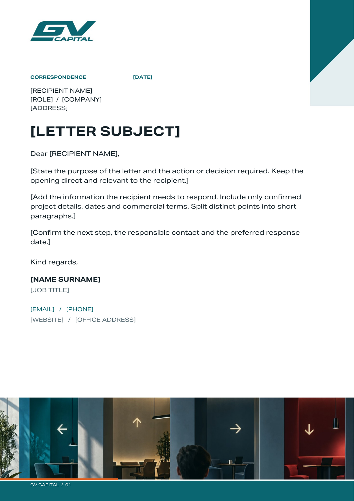
Letterhead
A4 correspondence with branded artwork and editable text.
DOWNLOAD WORD FILE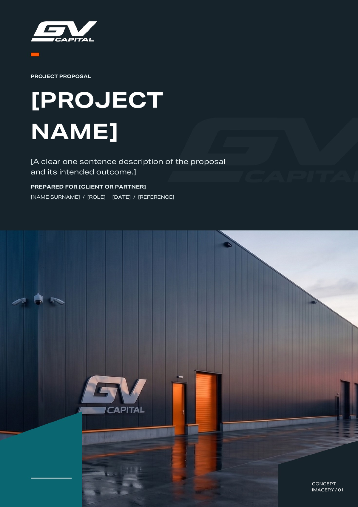
Project proposal
5 pages for the brief, delivery plan, commercial terms and approval.
DOWNLOAD WORD FILE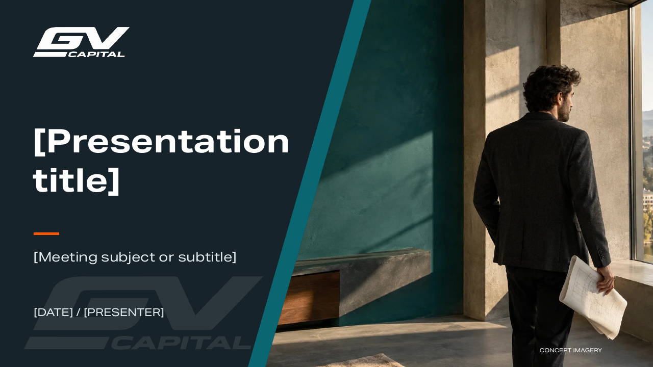
Presentation layouts
10 visual layouts with editable headlines, photographs and tables.
DOWNLOAD POWERPOINT FILEEXPLORE THE FOLDER IN 3D ↗
INTERACTIVE OBJECT / 01
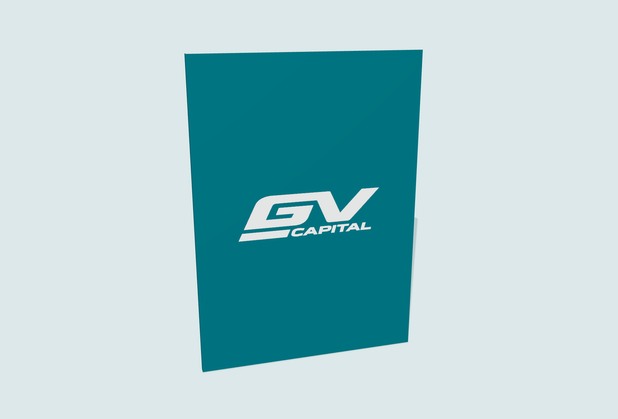
Corporate folder
GV / CORPORATEA4 FORMAT
Drag to rotate. Use arrow keys, + / − and Home on your keyboard.
THE CORPORATE EDITION
A4 format
Emerald outside. White logo. A light interior with a document pocket.
The 3D model loads when you open it.
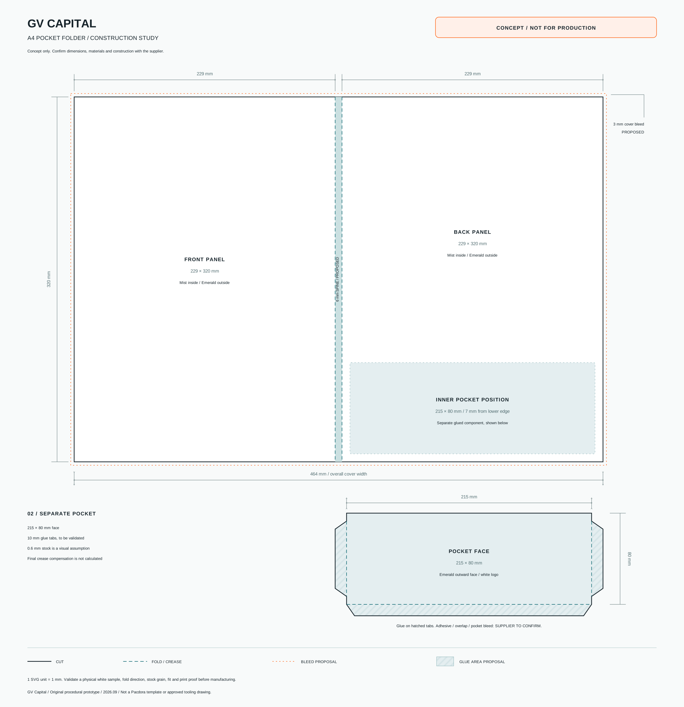
The layout shows the panels, spine and pocket. The print PDF includes both sides and a 3 mm bleed.
DOWNLOAD FOLDER PRINT FILEFormat
Format: 229 × 320 mm. Made for A4 documents.
Technical notes09 / BUSINESS MATERIALS
Business Materials
Formats for presenting the company and its opportunities.
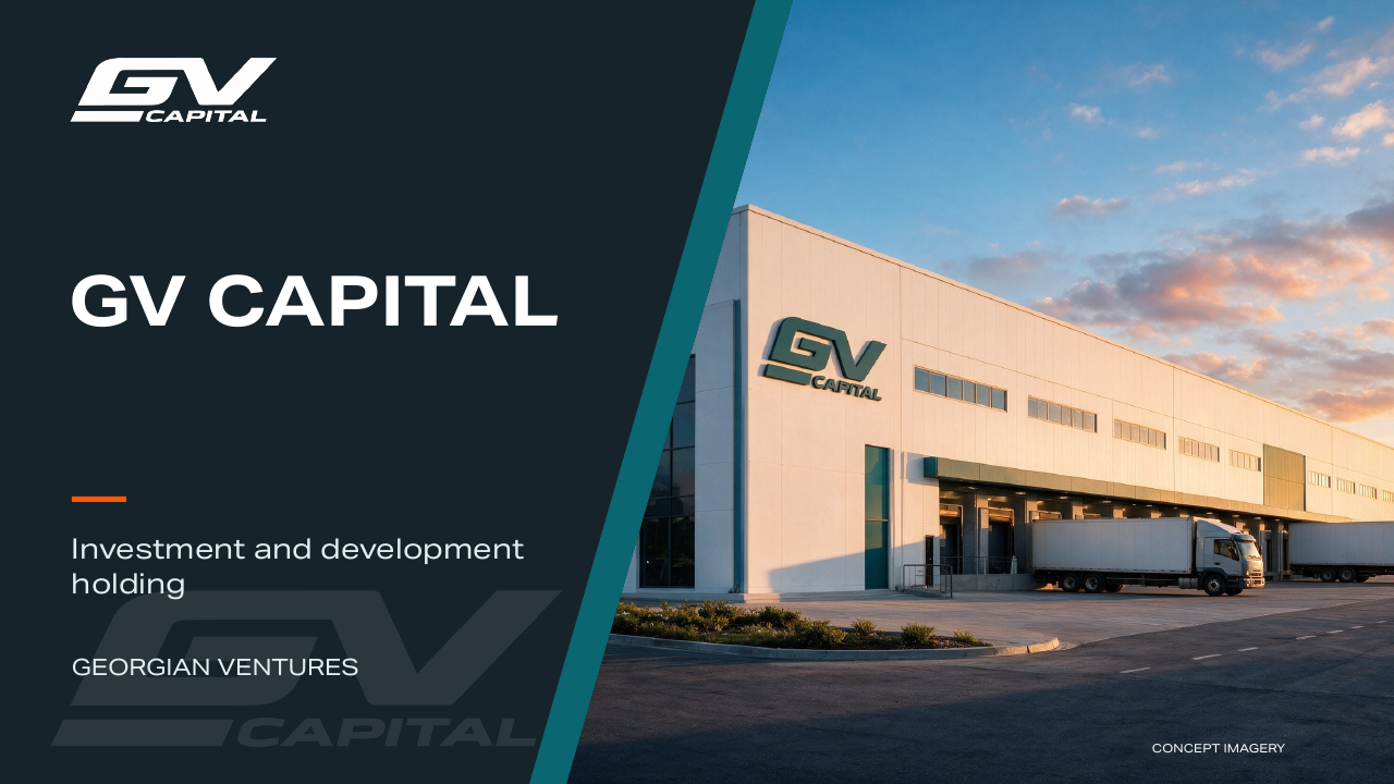
Company presentation
8 slides introducing GV Capital, its focus and approach to partnership.
DOWNLOAD POWERPOINT FILE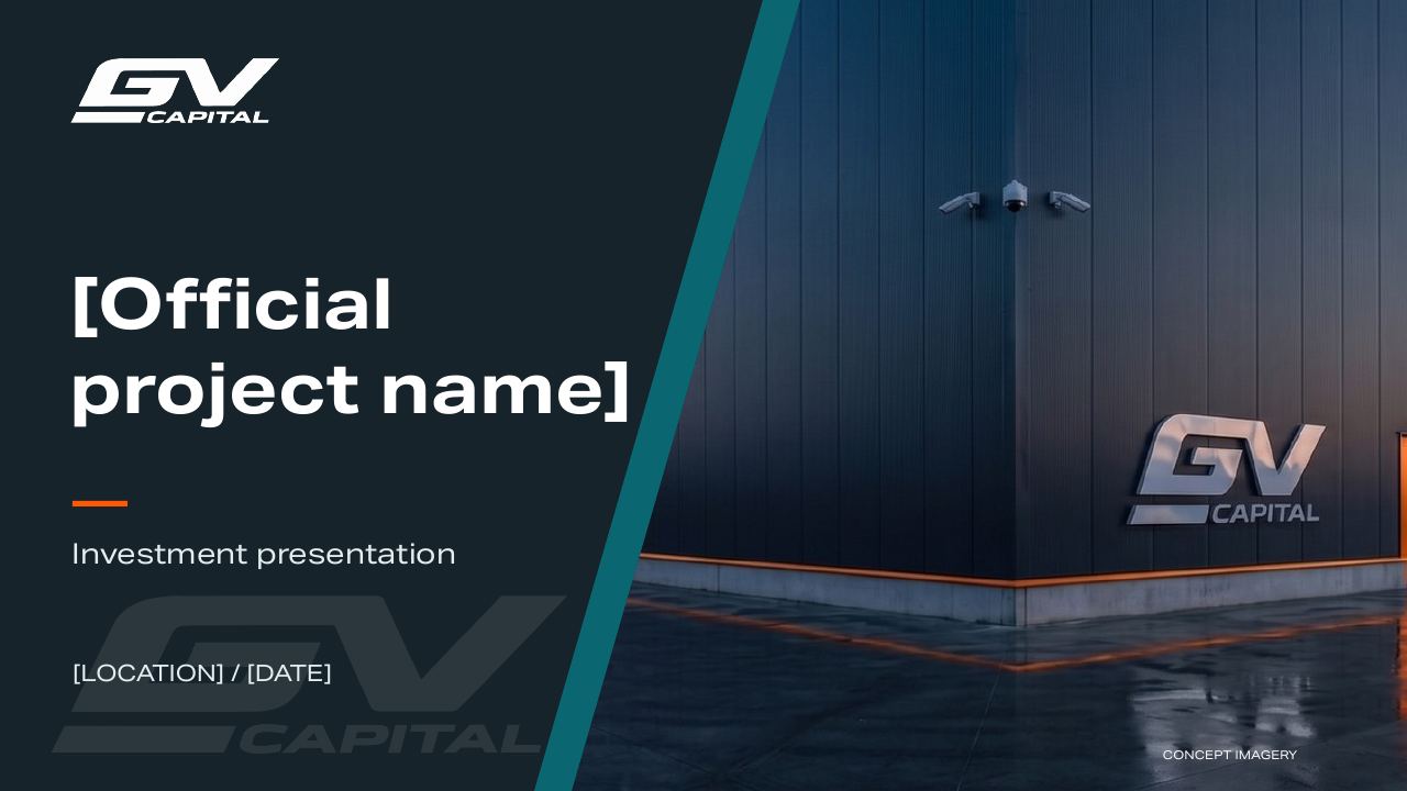
Investment presentation
8 slides for the project, investment model, delivery plan and risks.
DOWNLOAD POWERPOINT FILE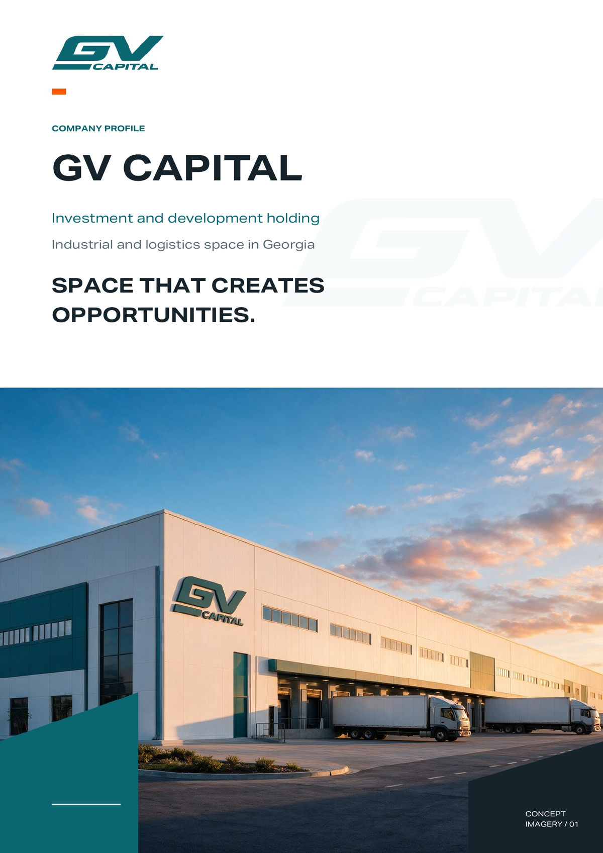
Company profile
5 editorial pages introducing the holding and its development focus.
DOWNLOAD WORD FILE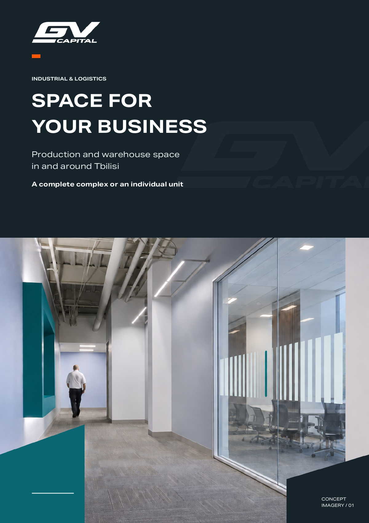
Information brochure
4 visual pages for space formats, project specifications and enquiries.
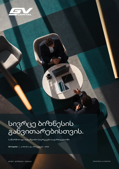
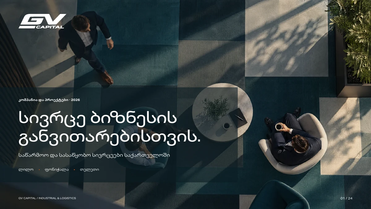
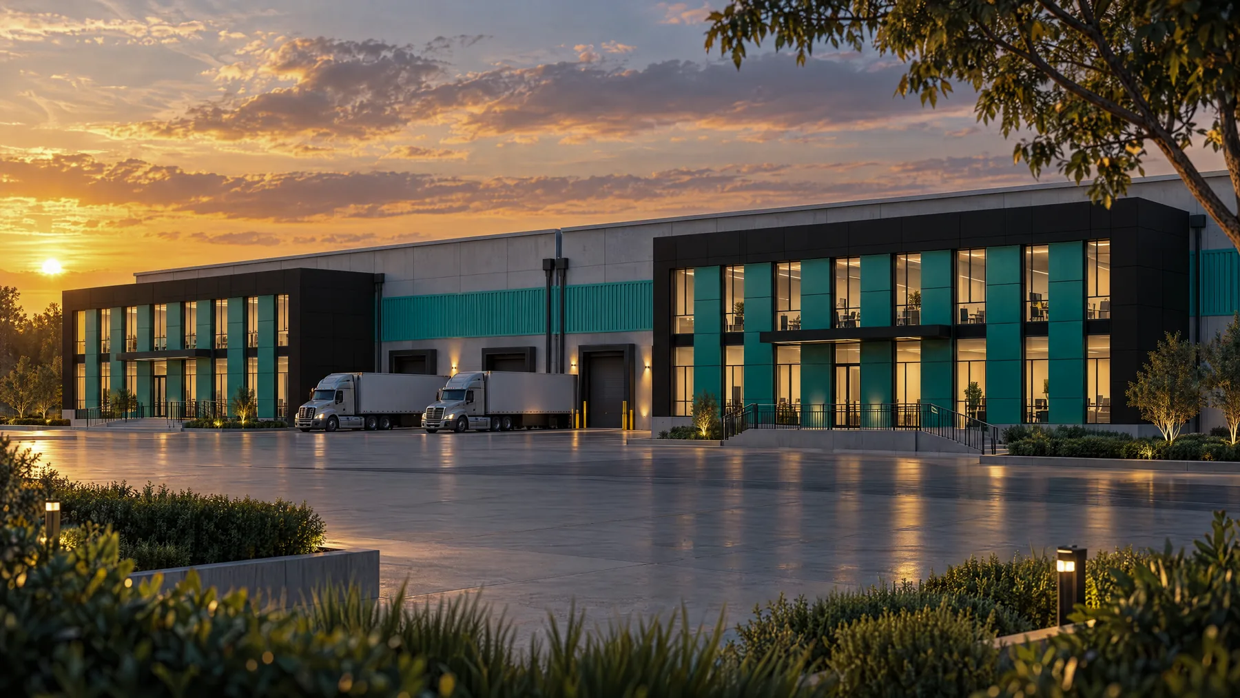
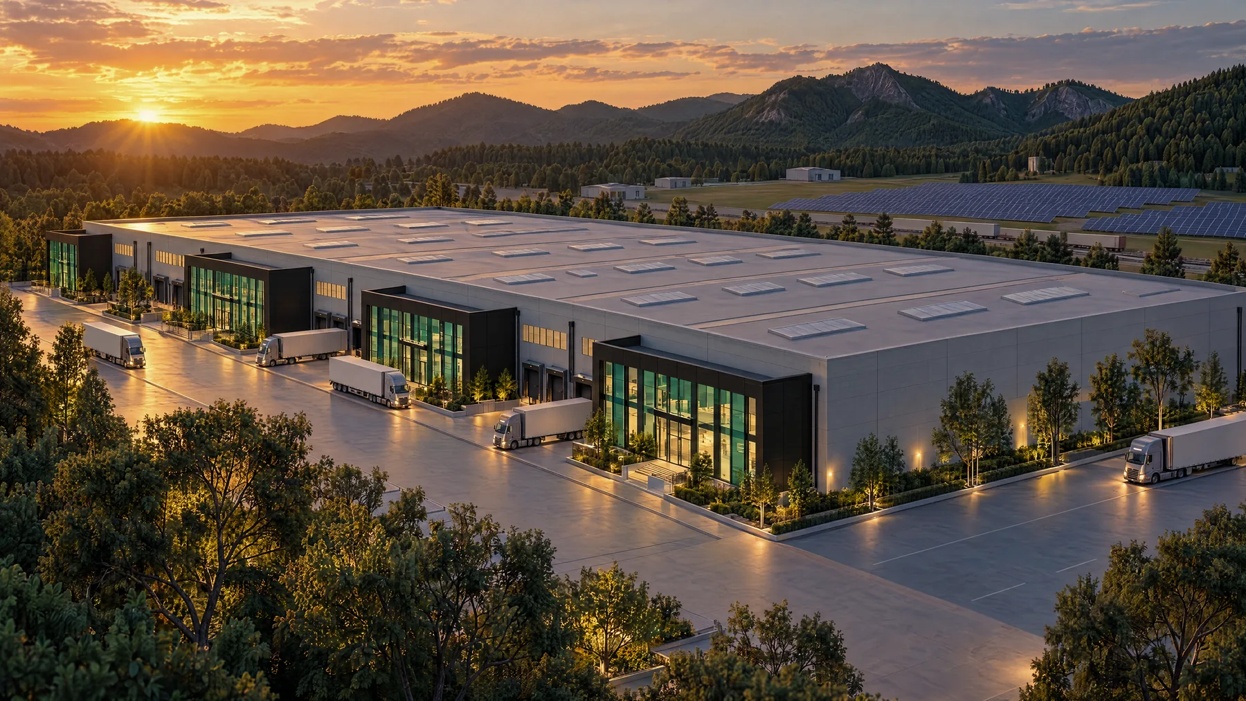
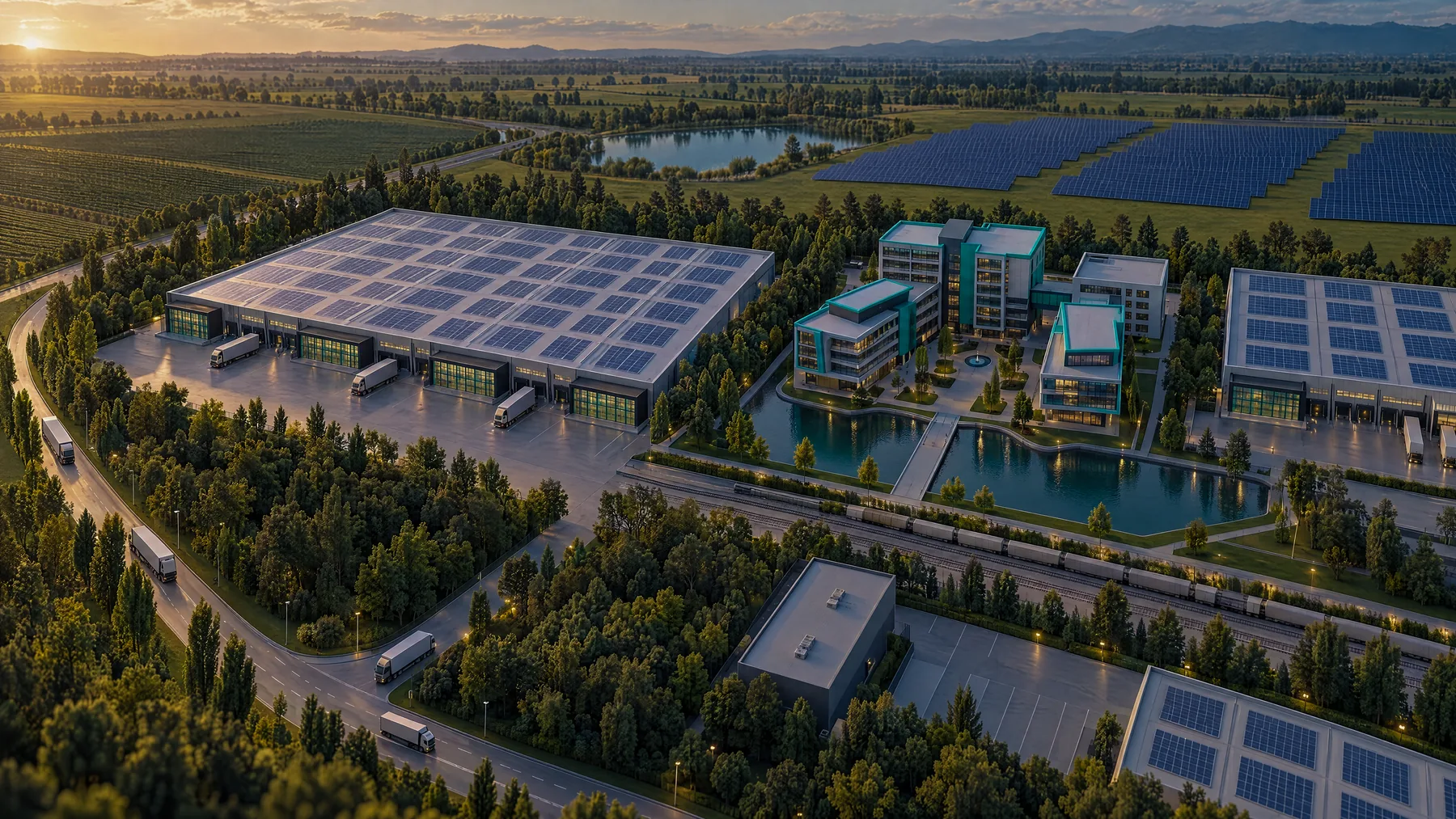
DOWNLOAD WORD FILEPROJECT PORTFOLIOGV CAPITAL / 2026
THREE PROJECTS. ONE BROCHURE.
Space for your next move.
10 / EVERYDAY IDENTITY
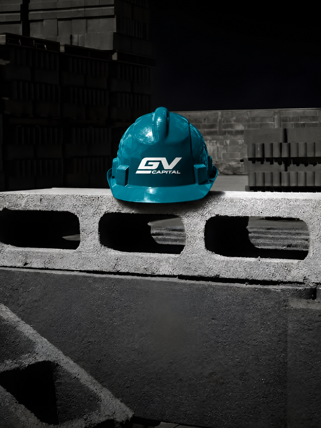
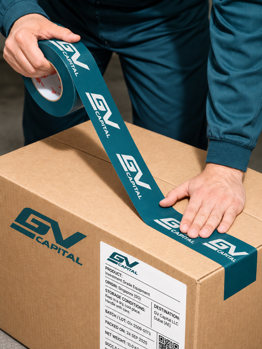
Everyday Identity
The brand in the team’s everyday environment.

EMPLOYEE / VISITOR
People first.
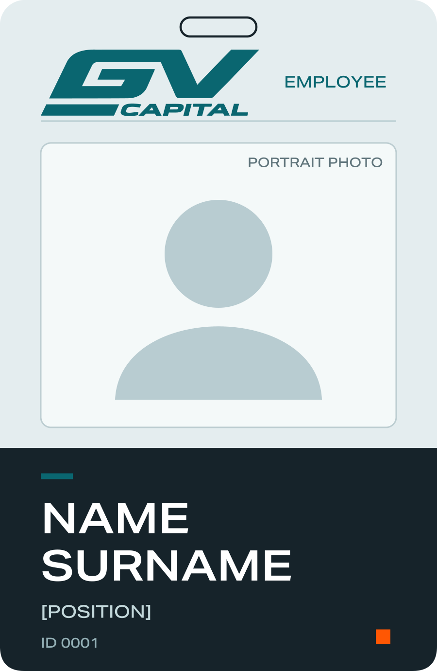
Employee badge
PRINT LAYOUT ↓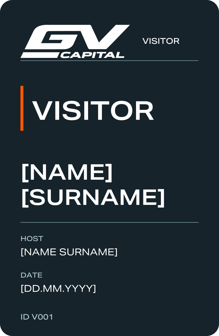
Visitor badge
PRINT LAYOUT ↓11 / BRAND IMAGERY
Brand Imagery
Real environments. Architectural scale. Industrial character.
01
Space and scale
Wide views. Strong geometry. Straight verticals. Room to breathe.
02
Life in motion
Working spaces, everyday movement and people in context.
03
Details that matter
Texture, materials and a precise brand finish.
Our visual approach +
Natural light. Balanced colour. Controlled contrast. The same approach applies to photography, 3D and AI imagery. Emerald belongs in surfaces and details, not in a green filter over the whole image. Keep the logo and its setting in context.
A flexible visual language with a calm, architectural feel. Clear, considered and grounded in real spaces.
These images, mockups and films set the mood for the brand across every format.

guidelines.
THE COMPLETE GUIDE / PDF
The whole brand.
The whole brand.
Ready to read and share.
Brand principles, visual identity and every application, organised by chapter. Save the guide in your preferred language.
12 / BRAND FILESThe brand files.
The brand files.
All in one place.
Brand assets, editable templates and ready-to-share files.
DOWNLOAD COMPLETE BRAND KIT↓Logo, compact GV and faviconCurrent vectors and exportsDOWNLOAD PACK ↓Corporate materialsLetterhead, documents, cards, signatures and foldersDOWNLOAD PACK ↓PresentationsA layout library and two presentation decksDOWNLOAD PACK ↓Company profile and brochureEditable Word files and matching PDFsDOWNLOAD PACK ↓Badges, uniforms and fleetEditable vectors and placement guidanceDOWNLOAD PACK ↓Digital templatesHomepage, project and news templatesDOWNLOAD PACK ↓Wayfinding signsFive layouts and a placement guideDOWNLOAD PACK ↓Brand graphicsSpace Field, layouts, colours and settingsDOWNLOAD PACK ↓

GV Capital · Brand Guidelines 2026
Social Media